Project description
The blog IAMHIA which has been online since 2009 deals with the themes of lifestyle, fashion, design, travel and inspiration around the artistic field.
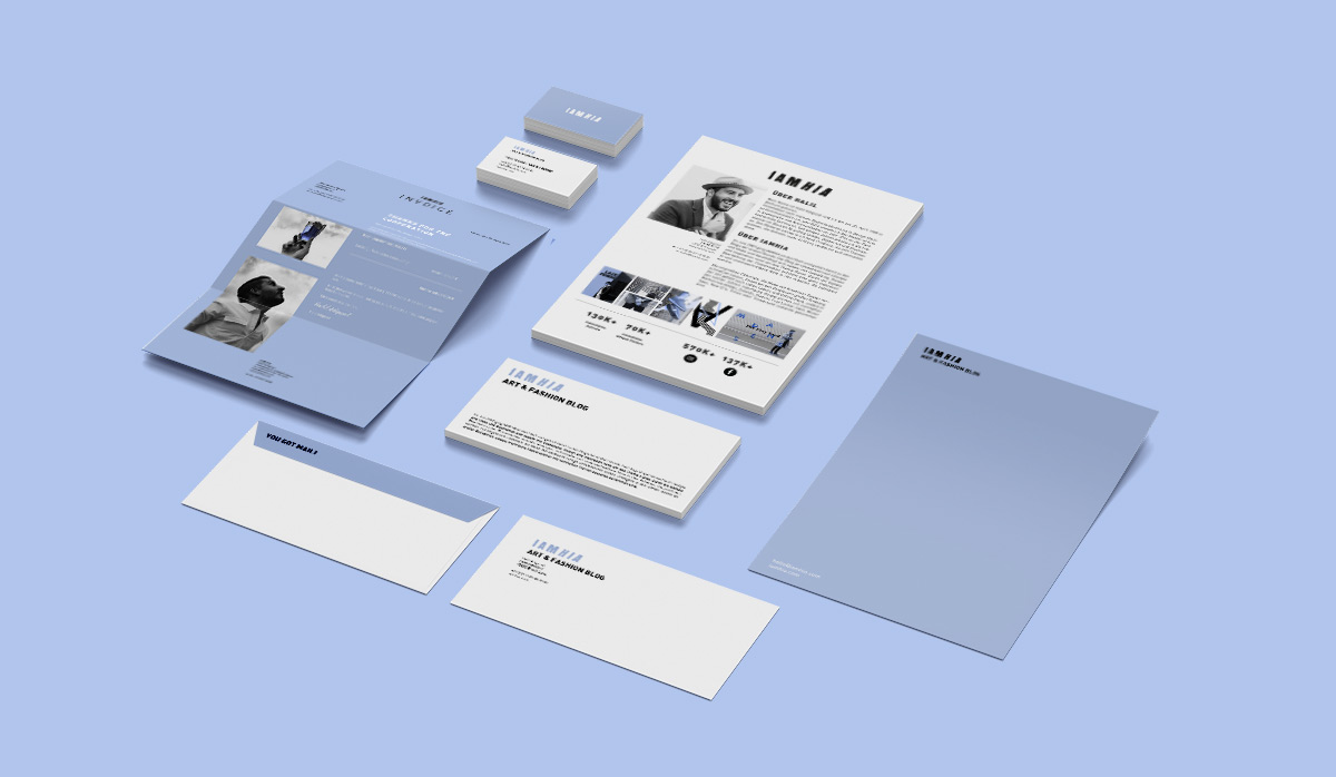
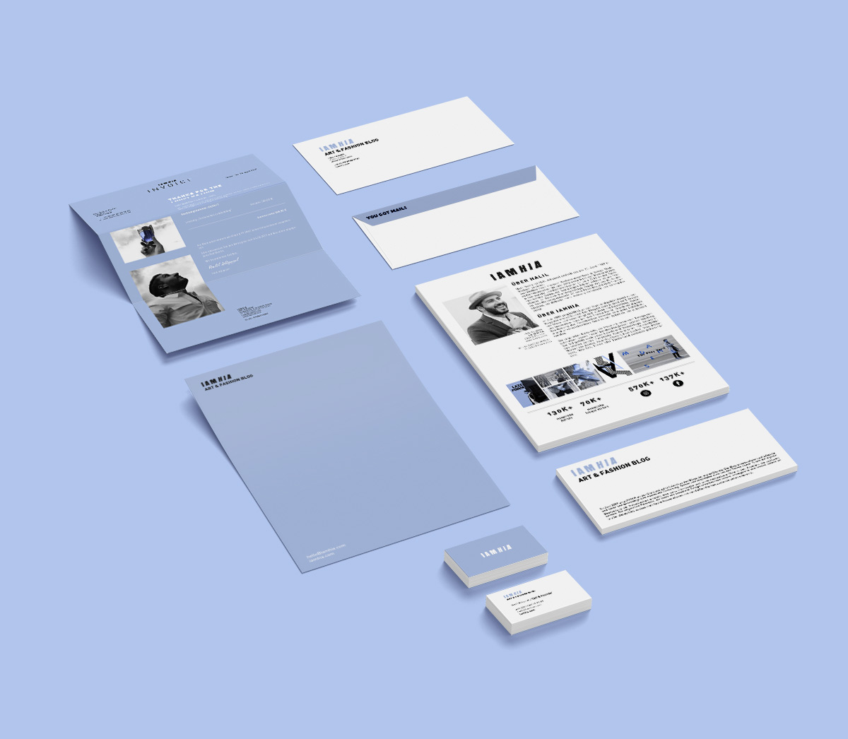
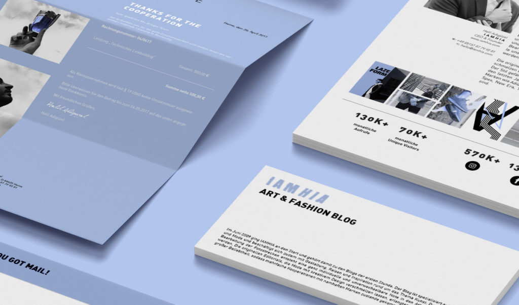
In 2012 the blog had a re-release and was updated. For this purpose, a completely new corporate design consisting of letterheads, business cards and the individually designed media kit was created.
IAMHIA stands for both a classic and a sporty look. The unique urban style is constantly recognizable in the works. A logo with a graffiti-like look based on the grotesque font „Anton“ was designed accordingly. The method of tracing the font by using a brush with an unclean basic shape gave the logo a striking and an appropriate grunge look.
The fresh blue color gives the street look the necessary contrast and it is also optimally suited for the image of the blog.


